In Log Insight 4.0, a new chart option was introduced. In this post, I would like to cover the new chart option. Read on to learn more!
Background
Visualizing data is powerful. Attempting to sort through unstructured data is not fun. Log Insight provides many means to make unstructured data analysis easier through machine learning (e.g., event type and event trends), but like they say, a picture is worth a thousand words.
What is a gauge chart?
A gauge chart or speedometer chart allows you to visualize numeric data and set thresholds based on values. As an example, think of metrics such as CPU usage. For most systems, 0-70% CPU usage is probably normal or “green,” 71-90% may be worrisome or “yellow,” and 91-100% may be cause for concern or “red.” A gauge chart allows us to visualize data in this way.
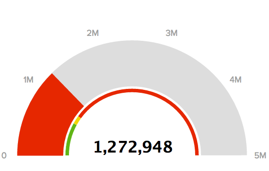
Now you may be saying, I thought metrics — or structured data — were meant for tools like vRealize Operations Manager?! They are! But sometimes, they appear in log data as well. The image at the top of this post shows maximum SCSI latency and marks anything over 1,000,000 ms (1 s) as red as that is typically an indication of a performance problem.
In addition, gauge charts are not just for traditional metrics. Any numeric values could be analyzed, including:
- Number of HTTP status codes
- Number of VMotions per VM
- Number of failed authentication attempts
How to use the gauge chart
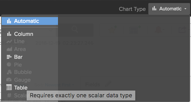
Just like any other chart option, simply hover over the option to see how to enable it:
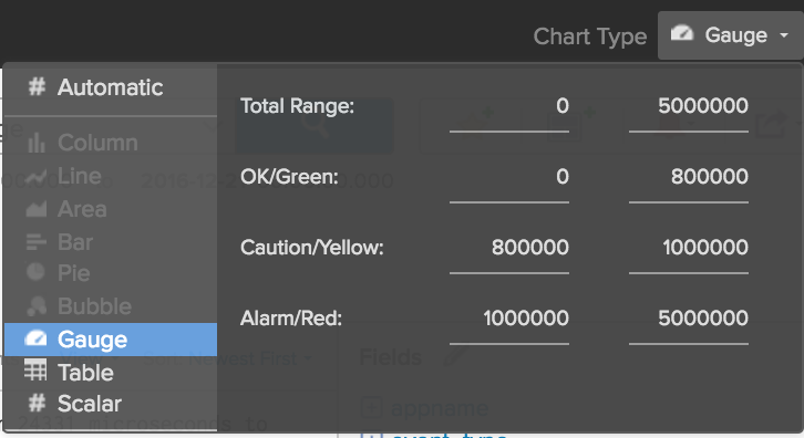
After you select it, you can adjust its parameters for sizing and coloring:
Finally, you can save or use this query just like any other (e.g., dashboard, favorites, content packs, etc.).
© 2017 – 2021, Steve Flanders. All rights reserved.


