In parts 1 and 2 of the query building series, I covered message queries or queries that return text results. In part 3, I would like to cover aggregation queries or queries that return visual results.
Overview
Aggregation queries in Log Insight take a message query and return a visual representation of the results. On the Interactive Analytics page, an aggregation query is always displayed near the top of the screen with the black background.

Aggregation queries can also be seen in other parts of the Log Insight UI including:
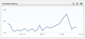
Widgets
As chart widgets on the Dashboards page.
Fields
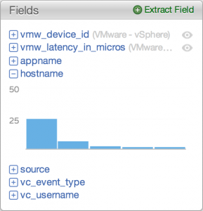
By expanding a field defined in the Fields section of the Interactive Analytics page.
Alerts
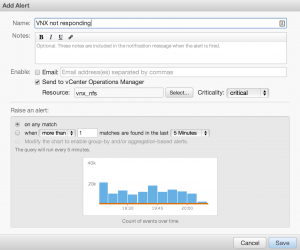
By creating or managing an alert.
An aggregation query requires two components that are explained in the following two sections.
Function
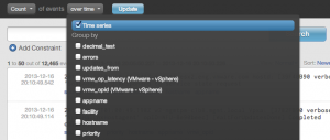
A function is an operator to apply to the results of a message query. By default, a count function is selected. The count function returns the number of results for a particular message query. In addition to the count function, several other functions are available by selecting the count drop-down box.

Grouping(s)
Groupings are a way to bring together different types of messages based on particular fields. By default, Log Insight groups information over time. In addition to or instead of over time, one or more fields can be selected by using the over time drop-down box.
Charts
Several types of visual representations are possible depending on the function and groupings selected:
Bar chart
Any time the function count or unique count and the grouping over time are selected.
 Any time the function count or unique count and one or more fields (not over time) are selected – results are displayed from the greatest field to the least field.

Stacked bar chart
Any time the function count or unique count, the grouping over time, and any single field are selected.

Line chart
Any time any function except count or unique count and the grouping over time are selected.

Stacked line chart
Any time any function except count or unique count, the grouping over time, and any single field are selected.

Multi-colored chart
Any time any function and the grouping over time with two or more fields are selected – the interchanging colors represent different time ranges is listed in the legend in the upper right.

Chart Options
The chart returned by an aggregation query can be changed in a variety of ways including:
- Resetting the chart to the default being count of events over time. The aggregation query can be reset by using the reset chart option to the right of the aggregation query.

- Changing the time range value per bar when using the over time grouping. The time range value per bar can be changed using the legend in the upper right.

- Changing the size of the chart by dragging and dropping the dividing line between the aggregation query and the message query.
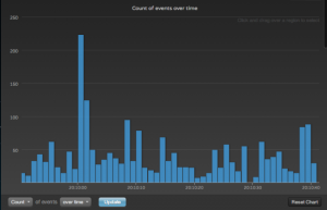
- Zooming in on a particular subset of data by dragging and dropping a range within the chart.
Summary
Aggregation queries offer a powerful way to process and group data in a way that is easy for users to consume. Some of the key takeaways for query building using aggregations are:
- Aggregation queries are visual representation of data from the results of a message query
- Aggregation queries must consist of one function and one or more groupings
- Queries can be saved in visual form using the Add to Dashboard option in the upper left-hand corner of the Interactive Analytics page
- The chart returned can be changed through a variety of chart options
- Fields are a critical part of aggregation queries
© 2013 – 2021, Steve Flanders. All rights reserved.


